


I like the MyUniversity website - it's clean, useful and mostly simple.
However, when using it the other day I found one extremely major flaw. It's not mobile friendly.
I recently reported that 47% of internet connections in Australia were now via mobile devices. This was based on an ABS report from the December quarter of 2011.
In other words, if your website isn't usable on a mobile device you are potentially only servicing 53% of the market.
On that basis there's a strong requirement for all organisations, including government agencies, to develop their sites to function effectively on mobile platforms.
My son is at a point where he's beginning to think about life after school and wants to know the options he has available, so I went on an exploratory trip into MyUniversity to see what was available in his areas of interest before taking him through it.
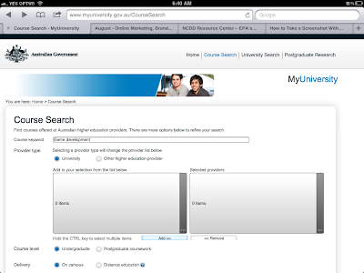
So I first went to the course search tool, to look for appropriate courses and entered in the topic he was interested in (it looks like below).
I got to the provider search tool and tried to use it - clicking on the box only works if, on a mobile device, you click precisely on the small '0 items' text in the middle. However this wasn't the main issue (though te size of the clickable area is a secondary issue, and why are universities called 'items'?)
When I clicked on the text the list of options, as below appeared.
I then selected QLD universities and a tick appeared (as below) - all good so far...
However this is where the trouble started. I selected 'Done' and the selection box disappeared.
The main window, however, still showed '0 items' (as below). But had't I just selected an item? Very confusing for users.
I checked several times by reclicking '0 items' and each time the selection box told me that yes I had chosen QLD universities.
So I decided OK, this is bad, but I will trust the system has remembered my choice despite not providing any cue to tell me this.
So next was the task of transferring my selection to the right-hand box (an entirely meaningless step) before a search could be performed.
I then selected 'QLD universities' AGAIN in this selection window. The second time I had to select it (as below).
Then I clicked 'Done' and found myself back at the initial screen - with '0 items' in both the left-hand and right-hand boxes (as below).
Sigh.
So I then chanced fate and clicked search - and the course selector worked as intended - finding me QLD universities with the selected course.
However let's recap the issues:
All-in-all, a very poor interface for mobile users.
Just in case I was unique in having this issue, I put my iPad in front of five other smart, university-educated adults and two teenagers considering university and asked them to complete a task to find a set of courses for a particular topic across universities in two states.
None of them were able to complete the task in under ten minutes using the MyUniversity interface, and only one (of the adults - the teens lost interest and went to Google) stayed with it and finally managed to get the search results they wanted - after receiving eight error messages (because they hadn't clicked in the right-hand box and selected the universities they wanted a second time).
Usability is important. A multi-million dollar project can fail if there isn't sufficient attention paid to the user interface.
Of course there may be an argument that a particular site has low usage by mobile users and therefore development dollars should be invested elsewhere. This sounds perfectly legitimate.
However this perspective raises some serious questions:
I hope that the agency responsible for My University does consider what it can do to become more mobile friendly. It's not really a hard fit, just change one step in a process and the problem would be resolved.
Then their site would be useful to 100% of Australian internet users, not to only 53% of them.
However, when using it the other day I found one extremely major flaw. It's not mobile friendly.
I recently reported that 47% of internet connections in Australia were now via mobile devices. This was based on an ABS report from the December quarter of 2011.
In other words, if your website isn't usable on a mobile device you are potentially only servicing 53% of the market.
On that basis there's a strong requirement for all organisations, including government agencies, to develop their sites to function effectively on mobile platforms.
My son is at a point where he's beginning to think about life after school and wants to know the options he has available, so I went on an exploratory trip into MyUniversity to see what was available in his areas of interest before taking him through it.
So I first went to the course search tool, to look for appropriate courses and entered in the topic he was interested in (it looks like below).
 |
| Initial course search screen in the MyUniversity website on iPad |
I got to the provider search tool and tried to use it - clicking on the box only works if, on a mobile device, you click precisely on the small '0 items' text in the middle. However this wasn't the main issue (though te size of the clickable area is a secondary issue, and why are universities called 'items'?)
When I clicked on the text the list of options, as below appeared.
 |
| Clicked on '0 items' in left-hand box in the course search screen |
I then selected QLD universities and a tick appeared (as below) - all good so far...
 |
| Clicked on 'QLD universities' in left-hand box |
However this is where the trouble started. I selected 'Done' and the selection box disappeared.
The main window, however, still showed '0 items' (as below). But had't I just selected an item? Very confusing for users.
I checked several times by reclicking '0 items' and each time the selection box told me that yes I had chosen QLD universities.
So I decided OK, this is bad, but I will trust the system has remembered my choice despite not providing any cue to tell me this.
(BTW I had to ignore the text cue under the box 'Hold the CTRL key to select multiple items' as this doesn't apply on mobile devices)
 | |||
| After clicking 'Done', the left box reverts to '0 items' |
So I clicked on the 'Add' button.
And nothing changed....
Both the left-hand and right-hand boxes continued stating '0 items'.
I clicked it several times, just in case I had done it wrong (a usual user reaction when they receive no indication that their action has been received and acted on).
Then I did click on the (too small) '0 items' text in the right-hand box and the following selection box appeared.
So my selection DID get transferred.
 | ||||||
| Clicked on '0 item's in the right-hand box of the screen |
 |
| Clicked on 'QLD universities' in the right-hand box |
 |
| 'QLD universities' now appears in the right-hand area |
So I then chanced fate and clicked search - and the course selector worked as intended - finding me QLD universities with the selected course.
However let's recap the issues:
- Selection areas too small
- Lack of visual cues for user actions
- Need to repeat actions which could be performed once to achieve the same objective
- Poor labelling of fields
- Generally clumsy interface poorly designed for mobile use
- No consideration of the differences in how web browsers may treat fields across versions and platforms
- Clearly no cross-platform user testing
All-in-all, a very poor interface for mobile users.
Just in case I was unique in having this issue, I put my iPad in front of five other smart, university-educated adults and two teenagers considering university and asked them to complete a task to find a set of courses for a particular topic across universities in two states.
None of them were able to complete the task in under ten minutes using the MyUniversity interface, and only one (of the adults - the teens lost interest and went to Google) stayed with it and finally managed to get the search results they wanted - after receiving eight error messages (because they hadn't clicked in the right-hand box and selected the universities they wanted a second time).
Usability is important. A multi-million dollar project can fail if there isn't sufficient attention paid to the user interface.
Of course there may be an argument that a particular site has low usage by mobile users and therefore development dollars should be invested elsewhere. This sounds perfectly legitimate.
However this perspective raises some serious questions:
- Are the agency's figures correct? Many mobile browsers report as standard web browsers, so it's not always clear when a web browser is in use on a mobile device.
- Is the mobile usage low because the site's audience don't use mobile devices, or because the site is unusable on mobile platforms? Perhaps the poor mobile design is why mobile users shun it - which then reflects in low mobile statistics and an argument by the organisation to not support mobile, ad infinitum....
- Isn't it irrelevant whether mobile usage is low? Government agencies are required to provide services accessible to all citizens, not just ones who happen to use desktop and laptop computers. Surely it's not that hard or expensive, in most cases, to ensure your interface is usable on mobile devices - millions of other website do it with little or no investment using inbuilt features in modern content management systems. An argument that you use an old CMS is not easily supportable, particularly when new systems cost very little to purchase or implement (depending on the level of customisation).
- Even if it's too expensive or difficult to justify building an interface which is both desktop and mobile compatible in the first place, aren't there accessibility requirements which websites (particularly government sites) must meet? If a website isn't mobile compatible it may also not be accessible on a desktop computer to users with some forms of accessibility needs.
I hope that the agency responsible for My University does consider what it can do to become more mobile friendly. It's not really a hard fit, just change one step in a process and the problem would be resolved.
Then their site would be useful to 100% of Australian internet users, not to only 53% of them.

No comments:
Post a Comment
Note: Only a member of this blog may post a comment.